
Embrace Your New Dashboarding Superpowers
Use AI to explore your data and build the interactive dashboards you've always wanted


In the past: if you (a business person) wanted to show your data a certain way, your best bet was probably wrangling Excel. Or asking IT and waiting for them to build you something. Or just doing without. None of which was ideal.
With AI, it’s now very different. You can build interactive dashboards and data visualizations without any prior technical knowledge. Simply describe what you want.
Ask AI: “I want to build an HTML dashboard for my Monday morning pipeline meetings. I want to show all active deals with filters by industry, stage, and partner. The data comes from my CRM. Ask me clarifying questions so you can put together a prototype.”
AI can create a simple first-draft prototype in 5-10 minutes - with sorting, filtering, drill-downs, charts, and more. A few hours of iteration after that and you’ll likely have a powerful tool your team never could have built before.
We are excited about this! And we’ve had fun building.
Claire built a rolling planning app. It combines live Jira data and other planning inputs into one source of truth for team coordination.
Katie built a finance dashboard. It combines data from Stripe, Gusto, Bill.com, and Quickbooks and makes it much easier to stay up-to-date.
For this article (and for fun), Claire built a data visualization to view all her Peloton data over the past 8 years. So much Peloton!
If Katie built a Peloton dashboard it would be… sparse. But she’s had fun digging into her past seven months of Stelo glucose monitor data - something that would have been impossible without AI.
So what are the challenges?
Getting started is easy. But building a robust, enduring tool is still challenging. There are three main challenges:
Maintaining the data. How can you make sure the data is accurate? And how can you easily update it or pull in live data?
Sharing the dashboard. How can you share the dashboard with your team?
Collaborating on the dashboard. How can you share responsibility for design and maintenance with other team members?
There’s a wide range here. You can start simple - a dashboard you maintain and share as a file. Or you can go further and deploy a mini application with live data, a database, and authentication. Claire even built a connector for her rolling plan dashboard so she and her team could ask AI to pull data from it when making slides.
This post covers how to get started, including some important recommendations on process steps and common pitfalls. In a future article, we’ll cover live data pulls and deployment.
The Foundation
It’s easy to jump right in to building with AI… “here’s some data, make it into a dashboard”. The initial gratification, however, will quickly turn into frustration. AI will build something fragile, with calculations buried inside the HTML display code. This becomes hard to audit and maintain - like cramming a complex formula into a single Excel cell.
Instead, we recommend separating three components in any dashboard. If you’ve made a dashboard in Excel or a BI tool, you’ve probably been doing all three without thinking of them exactly this way.
Gather. Get your data together in one place so you can work on it.
Organize. Combine the data from different sources, clean and analyze it.
Visualize. Show your insights and data to end users.
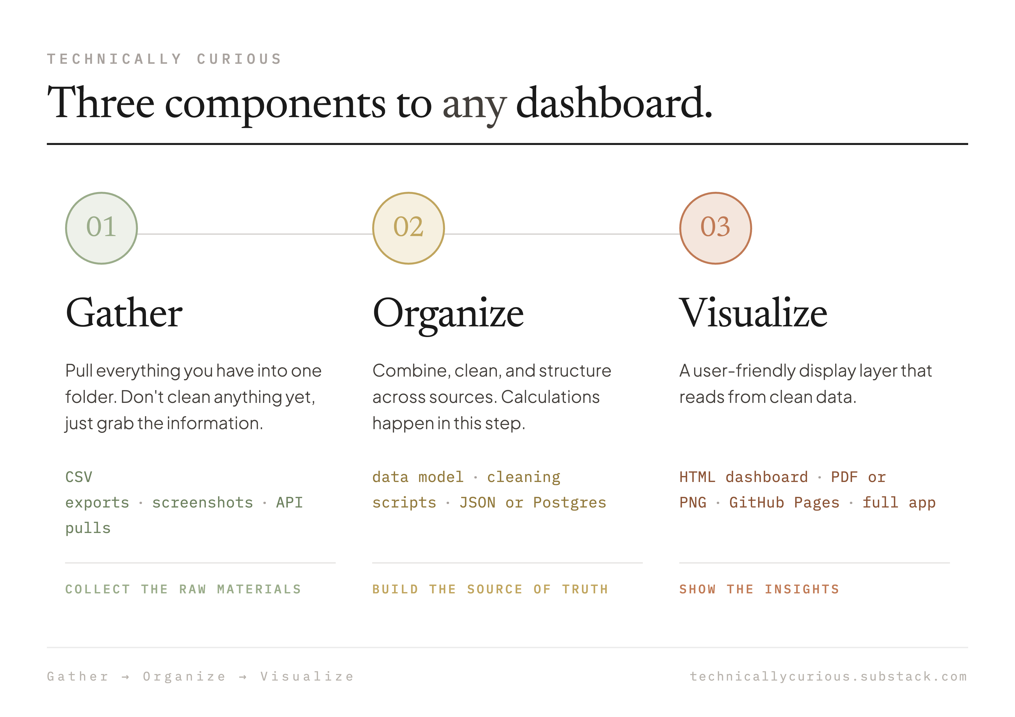
This separation is the foundation of successful dashboarding. And because each layer is separate, you can upgrade one without rebuilding the rest.
The Process
When you embark on building a new dashboard, follow these steps - ideally using Claude Code or Codex (GPT-5.5):
Gather your data. Share it with your AI. Provide the context on what you’re hoping to build.
Prototype the dashboard. Ask AI to help you design the dashboard. Iterate until you have clarity on desired outputs (and related inputs).
Design your data model. Have AI design how your data will be organized, calculated, and stored considering the raw inputs and desired outputs
Visualize. Have AI make the actual dashboard, pulling from your organized data.
Audit. Audit the data. Work with AI on checks it can run. Iterate on the final version.
Use it. Gain insights. Share it with your team. Update with new data.
We’ll walk through this process using Claire’s Peloton dashboard. You can follow along with the same data (here) or by applying the process to any of your own data (more fun!).
Note: you can have AI read Claire’s dashboard repository (just give AI the link or clone it if you use Github) and then ask AI to help explain to you how it works.
Step 1: Gather Your Raw Data
Gather your data. Don’t clean anything. Don’t organize anything. Just collect the raw materials in one folder on your computer:
Export a CSV from your system
Grab a PDF or other report
Screenshot a portal you can’t export from
AI reads all of these formats pretty well. If AI has trouble reading your PDFs, ask it to use Poppler (a popular library for working with PDFs).
In our example, Peloton’s website offers an export option to download all your workout history as a CSV file. We downloaded this as a ‘peloton_workouts.csv’ and put it into a ‘raw_data’ folder.
peloton-dashboard/
  ├── raw_data/                 ← Gather
  └──  └─ peloton_workouts.csv
Step 2: Prototype The Dashboard
We like to mock up our visualization design next, because it helps us better understand our data and helps define the right data model for the Organize step. There are three important parts of this design stage:
Prototype your visualizations
Explore your data
Have AI document your plan in a spec
You don’t want AI to build the real dashboard at this point. The goal of this step is to mock up what it might look like and to come to a better understanding of how the data fits together, including any gaps. If you jump right into making the real dashboard, you’ll inevitably run into things that need to change. AI will keep making modifications and your dashboard can rapidly become a Frankenstein.
AI loves to jump right into things, so be clear in your prompts: “Our goal of this step is a prototype of the dashboard, not the actual dashboard.”
Kick things off
Peloton:
“I’d like to create a dashboard that tells me how my Peloton performance has changed over the history in our dataset. The data is in the raw_data folder. Consider things like the volume of my training and my power output over time. We want to create a prototype design at the end of this session. Review the data, interview me to ask any questions, and show me potential visualizations of the data for my feedback.”
Finance:
“I want to build a dashboard to see our financial trends easily. It should help us understand revenue (segmentation, customers, trends), costs (GL, cost centers, vendor-level trends), and AR aging. There may be some data tagging/matching up that we’ll need to do. The data is in the raw_data folder (comes from Stripe, Gusto, Bill.com, Quickbooks). Quickbooks is the ultimate source of truth but the others will help with drill-down information. We’ll need to consider what’s accrual timing vs not. There’s a lot here so let’s think through how it all gets laid out. Let’s first work on layout so that we know what we are building towards. Then let’s explore the data in detail to make sure we understand how it will be represented in our dashboard. /grill-me”
We then go back-and-forth with AI, exploring the data and iterating on how the dashboard should look.
Explore the Data
Investigating your data is critical to success at this step. For example:
Peloton: With the Peloton data, there are rides and other kinds of workouts (strength, stretching). Should certain workouts (e.g. stretching) be excluded from total workout hours charts? Rides have different types (powerzone, tabata) and different lengths. How should we visualize trends? Should we only compare the same ride type and length combos?
Finance: Our Quickbooks data is on an accrual basis, but other sources reflect cash timing. Multiple accounts will need to be mapped together (e.g. two different accounts for the same customer, multiple payroll GLs we want to show together).
Stelo Glucose: Timezones and daylight savings turned out to be tricky topics, particularly given how Apple Health exports data.
We’ll often have AI show us mini visualizations or walk through examples to help understand the data better. We’ll share the questions we’re trying to answer to see if AI has ideas on the best way to show something.
Prototyping and Data Exploration go hand-in-hand and this work takes the bulk of the time. The more thorough the work you do here, the fewer changes and corrections will be needed later.
Tips
Question Asking: One practice we really like when working with AI is having it ask us questions. That helps avoid the need to put everything in a prompt upfront. It also helps us clarify our own thinking.
Grill-me: We especially love the /grill-me skill developed by Matt Pocock (an excellent instructor and X account to follow). /grill-me asks questions one at a time, progressing down each branch of the design tree until you reach a shared understanding. Try it, it’s awesome!
Voice Transcription: Sharing context with AI is very helpful, and most people are willing to speak more than they want to type. Try talking to AI and having it transcribe what you’re saying. We like WisprFlow and there’s also built-in voice transcription in Claude and Codex.
Share Examples: We also recommend sharing examples you do (and don’t) like. That could be a dashboard your team already uses. It could be a hand drawn or Excel sketch of your vision. It could be your company’s branding so that the colors and fonts match.
Have AI save the spec
Once you’re through this prototyping session with AI, ask AI to write up what you agreed on and save it as a file (this could be a markdown or HTML file depending on your preference). This becomes the blueprint for the dashboard - you’ll reference it in the steps that follow.
“Save what we just discussed as a dashboard spec. Include what we want to see, what data we have, and what’s out of scope. Make sure this is well-documented enough that we could pick up from a fresh session with just this file.”
Keep this saved in your working folder. Peloton design spec here.
peloton-dashboard/
  ├── DESIGN-SPEC.md           ← Specifications for your dashboard
  ├── raw_data/
  └──  └─peloton_workouts.csv
Step 3: Organize Your Data
This is the most important step, and one we see lots of people skip at first. You have raw data on one side and a spec for what you want to see on the other. Now you need the right structure in between.
Have your agent help with this. AI knows a lot about data model design.
“Given the data we have and the dashboard we designed, how should we structure our organized data? Map out what fields we need, what gets calculated, and how the raw data transforms into those fields. Document this data model.”
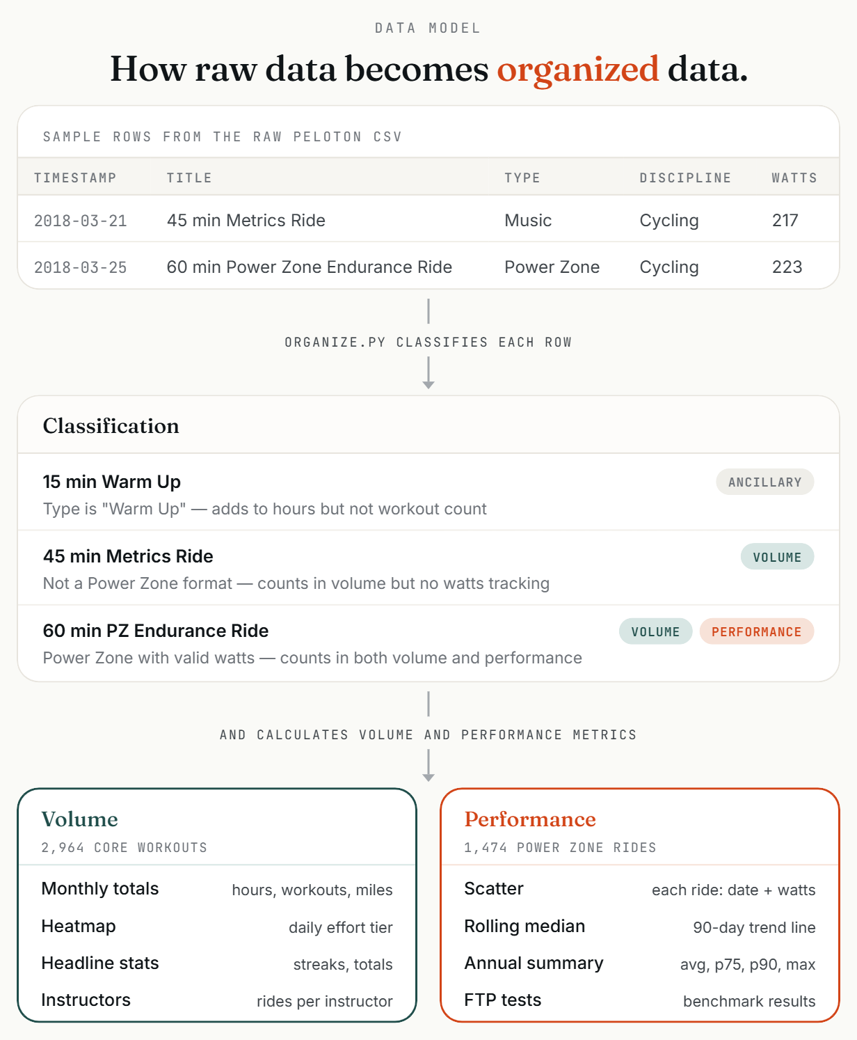
AI will map out how your data should be structured, including how rows get classified and what gets calculated. You can also ask it to build an HTML visualization of the data model, or to walk you through any calculations.
Below is a snapshot of how the Peloton data transformation works and you can read through a step-by-step explainer here.
Once you and your AI agree on the data structure, ask it to write the data organizer script and build the actual data file:
“Now read all my raw data and organize it into this structure. Implement as a script we can re-run when we have new data. Save the output as a single clean JSON file.”
JSON is simply a structured text file (labels + values) that AI has an easy time reading.
AI will keep building out your working folder.
peloton-dashboard/
  ├── DESIGN-SPEC.md
  ├── DATA_MODEL.md             ← Data model documentation
  ├── raw_data/
  │    ├── peloton_workouts.csv
  ├── organized/                ← Organized data and scripts
  │    ├── organize.py
  └──  └── dashboard_data.json  ← Clean JSON output
The critical design principle here: keep as many calculations out of the display layer as possible.
Step 4: Build the dashboard
Now have AI build the dashboard from your spec and your structured data:
“Using our dashboard spec, build a draft HTML dashboard that reads from the JSON data file we just created.”
You’ll get an HTML file. Open it in Chrome.
One thing to know: you have a design choice on whether AI takes the data from the JSON and embeds it in the HTML or whether the HTML reads in the separate JSON file. If it is embedded, the dashboard will be self-contained and a bit easier to share.
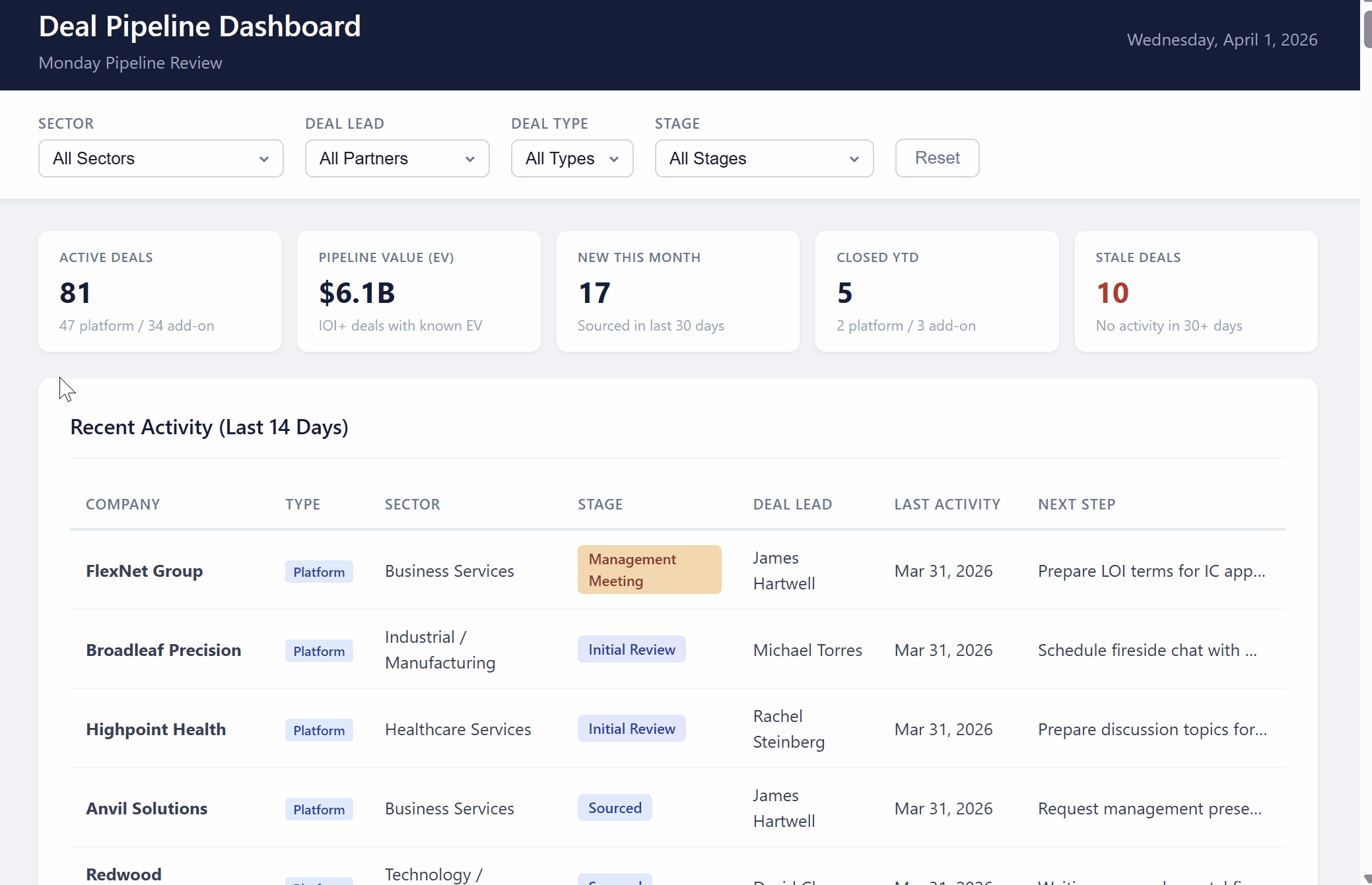
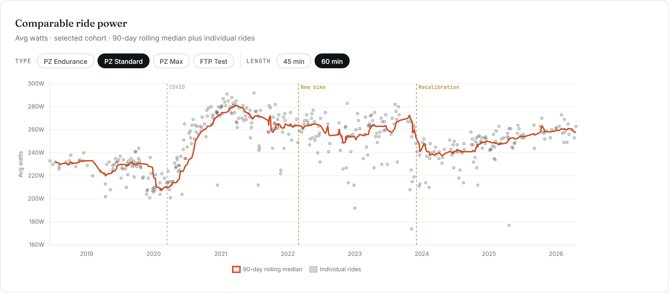
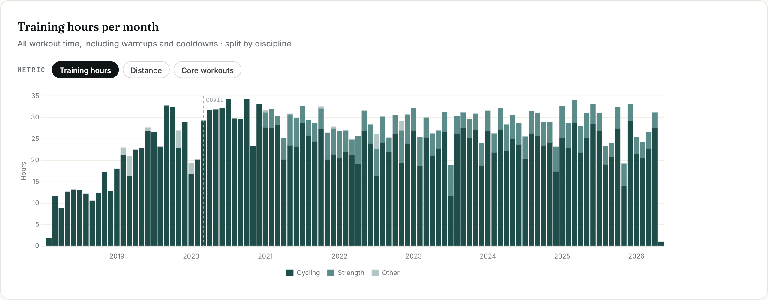
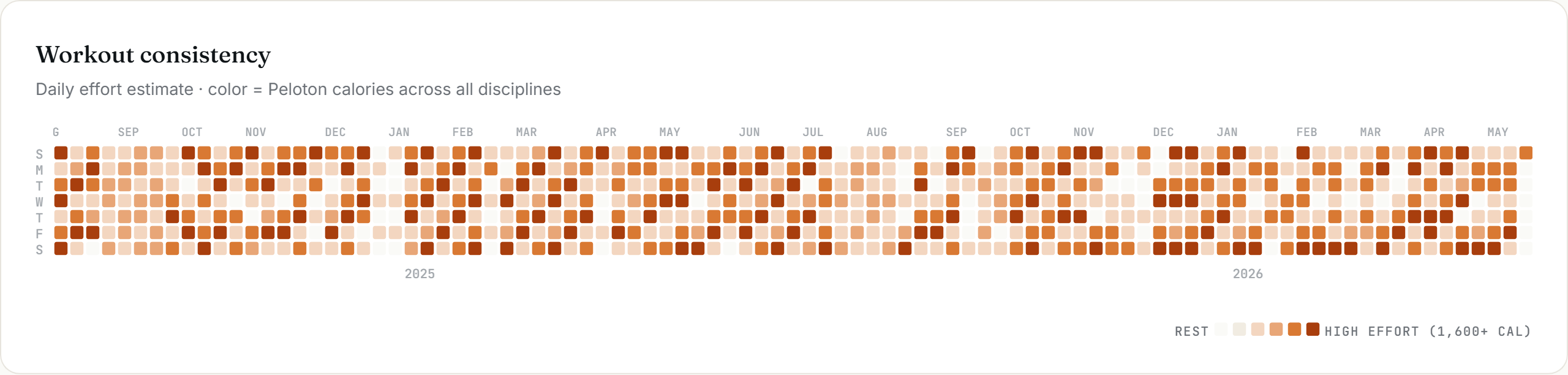
Here are a few sample charts from Claire’s workout dashboard. You can see the full interactive version here.
Your folder structure should now look something like the below for your dashboard. You can see Claire’s full example codebase here.
peloton-dashboard/
  ├── DESIGN-SPEC.md
  ├── DATA_MODEL.md
  ├── raw_data/
  │    ├── peloton_workouts.csv
  ├── organized/
  │    ├── organize.py
  │    └── dashboard_data.json
  └── dashboard/                ← Visualization
       └── dashboard.html
Step 5: Audit the Dashboard
You might know how to read through the Excel an analyst sends you, but if you’re like us, you’re not going line-by-line through a data pipeline. This means you need to audit like a managing director who only works on an iPad, sanity checking the outputs.
Some of the principles we use:
Document your calculations. Have AI help you - this is a great way to make sure your calcs are what you expect.
Cross-check number consistency. If the same calculation is used in multiple places, it should be the same number everywhere.
Sanity check. Does it all make sense together? Do trends make sense?
We like to have AI write itself a ‘dashboard QA skill’ to run on every update, based on these principles. It does a nice job coming up with new checks we didn’t think of.
Step 6: Use the Dashboard
Now you can use the dashboard!
Updating the Data
At this stage, the data isn’t pulling into your dashboard directly from your live systems. That means when you update your data, you need to update the dashboard too. Download new raw data. Tell your AI: “I’ve added new data to the raw_inputs folder. Re-run our organize script and inject the new data into the dashboard.” If your new data overlaps with existing data, have AI deduplicate first. You can also ask AI to write a deduplication script so this step is easier next time.
Open your updated dashboard and double-check that it all looks correct.
Sharing Your Dashboard
Now you may want to share your dashboard with others. There are multiple ways to do this, and some tradeoffs regarding complexity. Below, we cover the simplest options. And we’ll cover live data pulls and deployment in a future post.
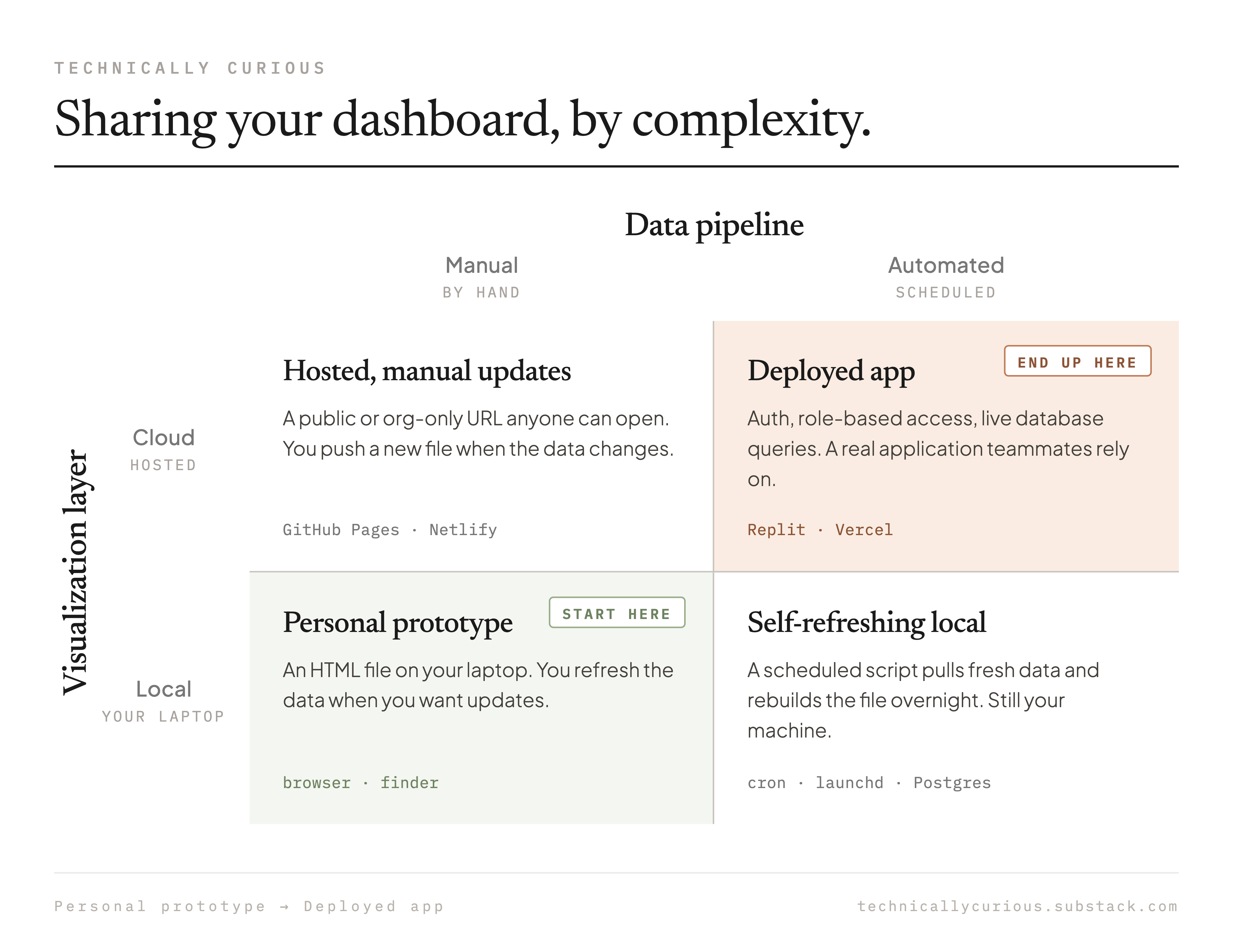
Share the HTML file
The most direct option - just send the file. The recipient opens it in Chrome. If your dashboard includes images, you’ll need to zip them together with the HTML file so nothing breaks. This works well for one-off sharing with a small group. You can also save the latest version on a shared drive, and the creator of the dashboard can update with the new version any time there are changes.
Export to PNG or PDF
If you want something the recipient can view without opening an HTML file, or if you need it for a slide deck or document, ask AI to add an export button to your dashboard. “Add an Export-to-PNG button”. Or hit Ctrl + P or Cmd + P to print to pdf. If the print-to-pdf doesn’t look great, ask AI to fix. This gives you a static snapshot you can paste or attach anywhere. Note: Claire’s dashboard has an Export-to-PNG button, so you could ask your AI to copy the implementation from the Github repository.
Just Remember…
We are excited for you to start building! But keep in mind, if you give an exec a dashboard … they may want another filter…
Technically Curious Disclaimer
We’re figuring this out and sharing what we learn as we go. This is intended to be practical advice based on our own experimentation - not professional guidance. We make no representations about accuracy or outcomes and aren’t responsible for how you use this information. Features and interfaces may change. We disclaim all liability, and you are responsible for your own use of AI.
Thank you to our talented co-builders and co-writers, Claude & Codex.
Happy building!
Katie (and Claire) - this is great! The Gather / Organize / Visualize framework is the right way to think about this, and I’m glad you put it in writing.
In my work, the instinct to skip straight to “here’s my data, build me a dashboard” is exactly where most we go wrong but it’s addicting!
I’ve been following your workflows and have applied this approach to a few of our own internal builds – the separation of layers makes everything easier to audit and update. The point about keeping calculations out of the display layer sounds obvious in hindsight but took my team a while to internalize! Thanks :)